Graphs are a wonderful tool. They help a skilled enough person fetch an enormous quantity of information in a glimpse.
Sometimes, though, a "normal" (read: linear) graph can be misleading or not sufficient. E.g.: say you have a function that grows very, VERY quickly. You need to estimate from visual data some satisfying enough information regarding the rate of growth.
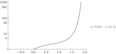
Now, for an untrained eye, functions like $e^x$ and $e^{x^{x^x}}$ may even look similar, leading, in case we are using a linear graph, to some coarse approximation error.
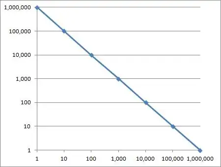
This cannot happen, though, if we use a log plot: here $e^x$ will look as a straight line, while $e^{x^{x^x}}$ is still gonna look like a fast-paced exponential-growing function. The pictures below represent said plots.

Of course, this is just one example, related to one of many different ways of representing data. Many others are possible, you just need to understand the context in which we use them.
Also, if you are into engineering, you might want to take a look to Bode plots. They are one of the most common examples of how a non-linear graph can help greatly the interpretation about data (in this case, concerning a system's frequency response).