Background
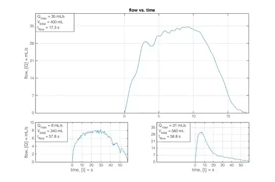
I'm analysing a data set of $M$ flow measurements (volume per time). The flows go from zero mL/s gradually to higher values and back to zero again, thus: their shapes ideally look like a Gaussian (or bell-shaped) curve. However, their shapes vary: they can go up and down (a little or a lot) over time. See the figure below for three examples.
The variations in the shapes are what I'm interested in. I'm using principal component analysis (PCA) in MATLAB for this purpose, with which I hope to find a (small) number of basic patterns that explain these variations in the flow curve shapes.
Note the following important steps I take: I interpolate the time axis, so all flows have an equal number of samples and all flows begin on $n=1,\,n\in N$ and end on $n=N$. I do this because I care only about shape, without time being of influence.
The data matrix $A$ I analyse with PCA has $M$ rows (observations) and $N$ columns (samples).
PCA
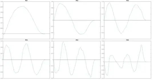
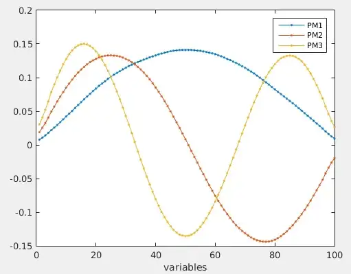
When I perform PCA on the aforementioned data, I get a quite peculiar result. I doubt it is by chance. The principal components (PCs) appear to be sinusoids, more or less. The first PC is a half period (positive) of a sinus, resembling the basic shape I describe in the first paragraph of this question. It is not a perfect sine, as it contains some variation. The second component is a full period of a sine: it goes up from zero, back to and through zero and becomes negative to then go back up to zero again. The third PC is one-and-a-half period, etc. See the figure below for the first 6 PCs (of $M=657$ flows).
I feel this has a connection with the Fourier series, because my principal components basically appear to be the frequency components of my original data, or are related to them. Is there an intuitive way (and a mathematical way, of course), to understand why I get this particular result? I guess the sinusoids are in fact the result of the relation between PCA and the Fourier series and the variation in the sinusoids is caused by the variations/noise in my data.


