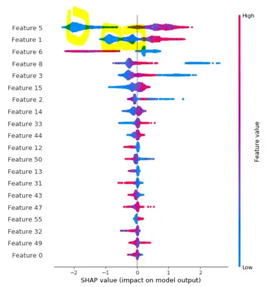
Here are an example of shap values plot from here. How to interpret the 'bubble' or 'spikes' on this shap values plot I highlighted in yellow color?
Asked
Active
Viewed 356 times
1 Answers
1
That's to help indicate the volume of points in that region, which would be lost due to overlap if all plotted along the horizontal line. This kind of plot is referred to as a "bee-swarm", and is somewhat similar to violin plots, strip plots, or scatter plots with jitter.
Ben Reiniger
- 12,855
- 3
- 20
- 63
