9

I know there are similar question on stats.SE, but I didn't find one that fulfills my request; please, before mark the question as a duplicate, ping me in the comment.

I run a neural network based on neuralnet to forecast SP500 index time series and I want to understand how I can interpret the plot posted below:

enter image description here

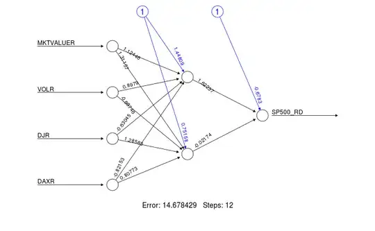
Particularly, I'm interested to understand what is the interpretation of the hidden layer weight and the input weight; could someone explain me how to interpret that number, please?

Any hint will be appreciated.

aeroNotAuto
  • 322
  • 2
  • 7
Quantopik
  • 279
  • 1
  • 3
  • 14

1 Answers1

8

As David states in the comments if you want to interpret a model you likely want to explore something besides neural nets. That said it you want to intuitively understand the network plot it is best to think of it with respect to images (something neural networks are very good at).

  1. The left-most nodes (i.e. input nodes) are your raw data variables.
  2. The arrows in black (and associated numbers) are the weights which you can think of as how much that variable contributes to the next node. The blue lines are the bias weights. You can find the purpose of these weights in the excellent answer here.
  3. The middle nodes (i.e. anything between the input and output nodes) are your hidden nodes. This is where the image analogy helps. Each of these nodes constitute a component that the network is learning to recognize. For example a nose, mouth, or eye. This is not easily determined and is far more abstract when you are dealing with non-image data.
  4. The far-right (output node(s)) node is the final output of your neural network.

Note that this all is omitting the activation function that would be applied at each layer of the network as well.

cdeterman
  • 391
  • 2
  • 8