2

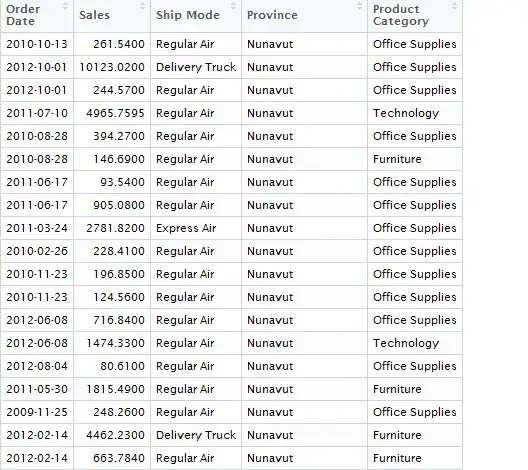
I have following type of data. But I would like to have graph with X-axis as Year and add all the sales added up in that year on Y- axis.

The Data frame name is salesdata. I have nearly 8000 rows of data. and the column headers are in the picture below.

enter image description here

Thanks!

Ashok Kandipati
  • 21
  • 1
  • 1
  • 4

2 Answers2

2

Step 1: Changing dates to years

First you can change your column of dates (Order_Date) to simply years by using this formula:

> salesdata$Order_Date = format(salesdata$Order_Date, "%Y")

This will give your Order Dates just the year the sales was done in.

Step 2: Summarizing your sales data

After this you can create a vector with the summarizations of your sales data per year. This can be done using tapply:

> tapply(salesdata$Sales, salesdata$Order_Date, FUN=sum)

This will give you an overview of the total sales per year.

Step 3: Plotting your graph

You can use barplot() to plot your bar chart using the values you got in your tapply function.

One-liner

The function as a oneliner:

> barplot(tapply(salesdata$Sales, format(salesdata$Order_Date, "%Y"), FUN=sum))

Of course you can edit your graph to your liking.

Example of the bar chart

Paul
  • 146
  • 4
0

Step 1: Summarizing

You can use the dplyr package for that purpose, as:

library(dplyr)
x %>% 
  group_by(Order_Date) %>% 
  summarise(Sales = sum(Sales))

OR, this approach will work as well,

x %>% 
  group_by(Order_Date) %>% 
  summarise_each(funs(sum))

Step 2: Plot

Once you're done with it, use ggplot to draw a plot of your interest, just use the respective function.

Additional Resources

For more details visit these blogs-

Hope it helps!

Abhishek
  • 1,999
  • 3
  • 15
  • 21