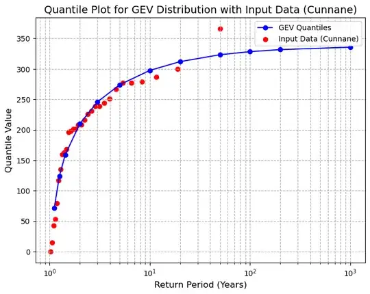
I am doing frequency analysis on many sets of snow data, which sometimes have (valid) zero values in the Annual Maxima Series.
To help guide the selection of distribution, I am calculating some goodness of fit statistics including AIC and BIC. I am finding that even for apparently reasonable distribution fits, the zero observations in my data create issues in calculating AIC/BIC. Calculating the probability of the zero observations returns zero, the log of which is -inf, so log likelihood is -inf and the AIC and BIC end up being infinite. This seems to happen even when I assign very small nonzero values to the zero values in the input data.
A minimum reproducible example below. I am wondering whether there is some kind of a defensible workaround for this to get a proxy AIC/BIC for the cases where this happens (frequently with Weibull but also other distributions on occasion - GEV shown here).
import numpy as np
import lmoments3.distr as ld
import matplotlib.pyplot as plt
data=np.array([279, 244, 226, 216, 300, 208, 267, 239, 201, 277, 135, 79, 201, 15, 198, 231, 251, 277, 168,
      43, 53, 160, 366, 163, 239, 287, 196, 117, 0, 208])
data[data==0]=1E-07
return_periods = np.array([1.1111, 1.2500, 1.4286,2,3,5,10,20,50,100,200,1000])
Fit GEV distribution to the data
params = ld.gev.lmom_fit(data)
Calculate quantiles for the given return periods
quantiles = ld.gev.ppf(1 - 1 / return_periods, **params)
Calculate Cunnane plotting positions for the data
n = len(data)
sorted_data = np.sort(data)
ranks = np.arange(1, n + 1)
empirical_cdf = (ranks - 0.4) / (n + 0.2)  # Cunnane plotting positions
data_return_periods = 1 / (1 - empirical_cdf)
Plot the quantile plot
plt.figure(figsize=(8, 6))
plt.plot(return_periods, quantiles, marker='o', linestyle='-', color='b', label='GEV Quantiles')
plt.scatter(data_return_periods, sorted_data, color='r', label='Input Data (Cunnane)')
plt.xscale('log')
plt.yscale('linear')
plt.xlabel('Return Period (Years)', fontsize=12)
plt.ylabel('Quantile Value', fontsize=12)
plt.title('Quantile Plot for GEV Distribution with Input Data (Cunnane)', fontsize=14)
plt.grid(True, which="both", ls="--")
plt.legend()
plt.show()
n = len(data)
empirical_cdf = (np.arange(1, n + 1) - 0.4) / (n + 0.2)  # Cunnane plotting positions
return_periods = 1 / (1 - empirical_cdf)  # Convert CDF to return periods
logpdf_values = ld.gev.logpdf(sorted_data, params)
pdf_values = ld.gev.pdf(sorted_data, params)
log_likelihood = np.sum(logpdf_values)
print(f"log likelihood: {log_likelihood}")
k = len(params)  # Number of parameters in the model
aic = 2 * k - 2 * log_likelihood
bic = k * np.log(n) - 2 * log_likelihood
print(f"AIC: {aic}")
print(f"BIC: {bic}")
