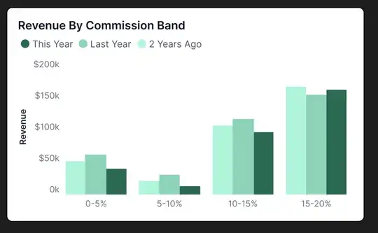
I've got to visualise revenue x commission rates over 3 years in a single visual. I'm looking for suggestions to improve communicating the data vs the approach I've got now.
I feel like the current visualisation is lacking in some way - the live dataset uses 8 commission bands, so a stacked chart feels like it will be very busy or difficult to interpret when populated with live data:
I've considered utilising a matrix somehow but I'm wondering if anyone's had to display similar data?
