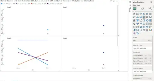
I have a dataset that summarizes student absences grouped by School Site, Grade, Gender, Race and it is broken down into groups with total # of students that had: Absence <5%, Absence 5-10%, Absence 10-20%, and Absence >20%. Here is an example of what the data looks like:
| Site | Grade | Gender | EthnicityRace | Total People | Absence <5% | Absence 5-10% | Absence 10-20% | Absence >20% |
|---|---|---|---|---|---|---|---|---|
| Site A | 1 | F | Race3 | 1 | 0 | 0 | 0 | 1 |
| Site A | 1 | F | Race5 | 1 | 0 | 1 | 0 | 0 |
| Site A | 2 | F | Race3 | 1 | 1 | 0 | 0 | 0 |
| Site A | 3 | F | Race3 | 2 | 0 | 1 | 0 | 1 |
| Site A | 3 | M | Race5 | 1 | 0 | 1 | 0 | 0 |
| Site A | 4 | F | Race3 | 2 | 1 | 0 | 0 | 1 |
| Site A | 4 | M | Race3 | 1 | 0 | 0 | 0 | 1 |
| Site A | 5 | F | Race3 | 3 | 1 | 0 | 0 | 2 |
| Site A | 5 | M | Race3 | 2 | 0 | 2 | 0 | 0 |
| Site A | 5 | X | Race3 | 1 | 1 | 0 | 0 | 0 |
| Site B | 1 | M | Race2 | 1 | 0 | 0 | 0 | 1 |
| Site B | 1 | M | Race3 | 7 | 0 | 1 | 1 | 5 |
| Site B | 2 | M | Race2 | 1 | 0 | 0 | 0 | 1 |
| Site B | 2 | M | Race3 | 1 | 0 | 0 | 1 | 0 |
| Site B | 2 | M | Race4 | 1 | 0 | 0 | 0 | 1 |
| Site B | 3 | F | Race3 | 1 | 0 | 0 | 1 | 0 |
| Site B | 3 | M | Race4 | 2 | 0 | 0 | 0 | 2 |
| Site B | 4 | F | Race3 | 1 | 0 | 0 | 0 | 1 |
| Site B | 4 | M | Race5 | 1 | 0 | 1 | 0 | 0 |
| Site B | 5 | M | Race1 | 1 | 1 | 0 | 0 | 0 |
I am trying to use Power BI to graph the breakdown of absences for each of the buckets (<5%, 5-10%, 10-20%, >20%) for each site and some of the other characteristics (like Grade, Gender, or Race).
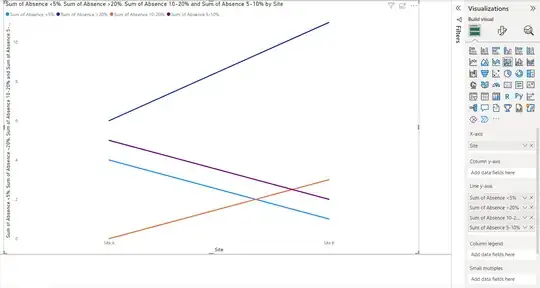
I made the following chart using Site as the X-axis, Sum of Absence <5% as the Y-axis, and Race as the legend:

However I can't seem to be able to add any of the other Absence columns to the Y-axis and I cannot add it to the Secondary y-axis.
What would be the best way to use Power BI to display each of the absence buckets for each Site/Race breakdown?

