0

this is a more general question asking about Python libraries that are able to showcase networks with following criterias:

  • Different size of the nodes depending on a metric (e.g. sum of some variable X received by all other nodes)
  • Direction of the connection between the nodes (e.g. Node A sends X units to Node B, while Node B sends Y units to Node A and Q units to Node C) - So a node can receive and send at the same time.
  • The connectors may vary in "thickness" relative to each other depending how many units they receive/send
  • Dynamic UI - Network should be dynamic for e.g. filters like date ranges etc. that can be selected by the user.

I checked for Networkx and Plotlty, however they do not satisfy the direction criteria of the connectors.

Someone any idea?

A representation like this would work as well: https://viz.ged-project.de/
Maeaex1
  • 570
  • 2
  • 15

1 Answers1

0

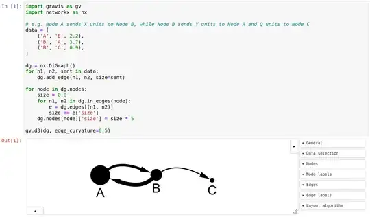
Here's a solution based on gravis, an open source Python package I've written for network visualization. I think it fulfills all your requirements except live filtering by date ranges, though other forms of interactivity are available such as dragging nodes and changing node and edge appearances:

import gravis as gv
import networkx as nx

e.g. Node A sends X units to Node B, while Node B sends Y units to Node A and Q units to Node C

data = [ ('A', 'B', 2.2), ('B', 'A', 3.7), ('B', 'C', 0.9), ]

dg = nx.DiGraph() for n1, n2, sent in data: dg.add_edge(n1, n2, size=sent)

for node in dg.nodes: size = 0.0 for n1, n2 in dg.in_edges(node): e = dg.edges[(n1, n2)] size += e['size'] dg.nodes[node]['size'] = size * 5

gv.d3(dg, edge_curvature=0.5)

Here's how it looks when that code is used inside a Jupyter notebook, though it could be done in a regular Python interpreter as well:

networkvis

Robert Haas
  • 111
  • 3