I was writing a simple program to help visualize inequalities based on 2 variables. The test inequality that I was using was this: $$\sin\left(0.1(x^2+y^2)\right)\geq0$$ Regions that satisfy the inequality are coloured in white.
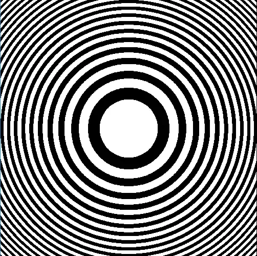
Here's the result, for a bounding box of $(-25,-25),(25,25)$:
Now, I am aware that due to computational inefficiency and round-off errors, we might often get absurd and incorrect results while doing simulations. But the results, when I chose a bigger bounding box, were not what I expected.
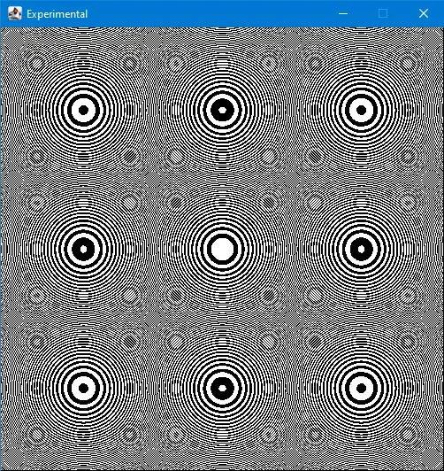
For bounding boxes $(-50,-50),(50,50)$ (left) and $(-250,-250),(250,250)$ (right):

I was expecting glitches, random patterns, maybe something like Moire patterns. But this regularized repeating behaviour (especially in the largest bounding box) seems too orderly to be a result of errors. While I am convinced that the first image is closest to the truth, but there is no way I can explain this "beauty in error".
All I can see:
- Initial appearance of randomly located circular patches.
- Circular patches get relocated to grid locations.
- Cyclization between the previous two.
- Overarching larger circles that encompass the smaller ones.
I am looking for ideas that might explain how this pattern might result from computational errors.
Zoom-out animation:
Edit:
Something really wonderful happens if I allow the zoom-out process to continue longer. The first (and the correct) pattern appears again, and the cycle starts anew:
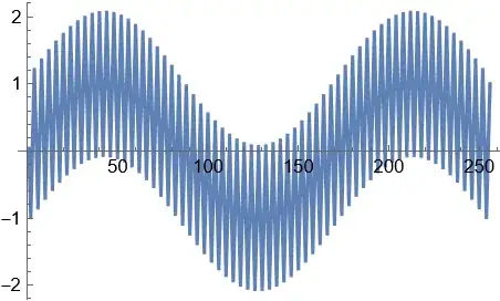
As many have noted in the comments, aliasing might be the cause of these patterns. But as of yet, everywhere I have seen, aliasing is shown as a negative factor, something to be removed. But has any research been done on how it can result in such beautiful patterns?
Edit:
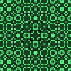
Apparently, aliasing can be used to make even prettier patterns. Here’s what happens if we sample at a less points (sparse sampling):
More of such beautiful icons here


