This question is based on a Puzzling Stack question I answered.
Suppose you have a loaded $10$-sided die that gives one value with probability $\frac7{25}$ and the rest with probability $\frac2{25}$ each, but you do not know the favoured value. A maximum likelihood method to determine this favoured value is as follows:
- Set probabilities $p_1=\dots=p_{10}=\frac1{10}$, where $p_i$ is the likelihood of $i$ being the favoured value.
- Roll the die repeatedly; for each value $c$ that comes up multiply $p_c$ by $3.5$, the ratio of probabilities of a favoured face to an unfavoured face. Normalise after each update and stop when one $p_i$ becomes dominant enough.
This strategy is quite efficient, for simulating it $4121000$ times gave a mean of about $35.47$ rolls until one $p_i$ exceeded $0.99$ and a median of $32$ rolls. The histogram of rolls needed, however, looks very odd with its wavy top:
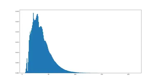
Is there any logical explanation for the histogram's peculiar shape? The number of simulations I made certainly seems high enough to rule out sample size as an explanation.
Here is the histogram corresponding to a d3 with one value twice as likely ($1/2$) to come up as the other two ($1/4$):
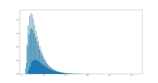 Clearly there is a dependence on the number of possibilities, but what kind?
